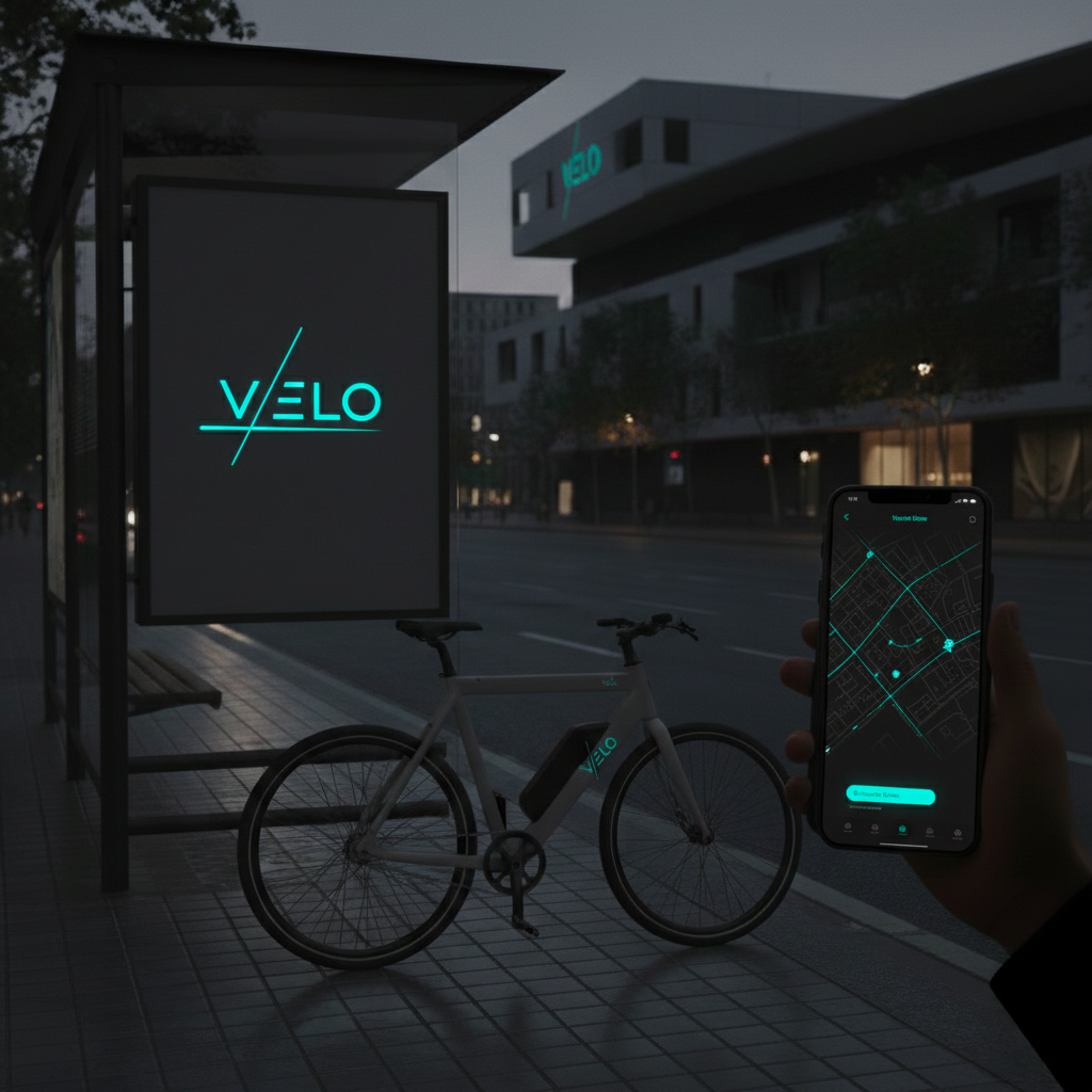
Case Study: "velo"
The Challenge: building a brand identity for a high-end e-bike subscription service that appeals to urban professionals, prioritizing sophistication over typical tech-aggression.
The Solution: the identity focuses on "Velo" (Speed). A sleek, dark-mode visual system combined with high-contrast electric accents ensures visibility and a high-tech feel across digital interfaces and city streets.
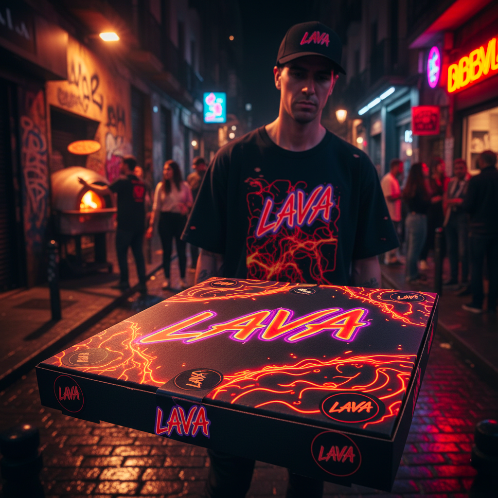
Case Study: "lava"
The Challenge: to disrupt the traditional "pizzeria" imagery by blending underground club culture with gourmet street food.
The Solution: "Lava" features a high-impact, distorted typography and a neon-drenched palette. The branding extends to "merch-like" packaging and apparel, creating a lifestyle brand rather than just a restaurant.
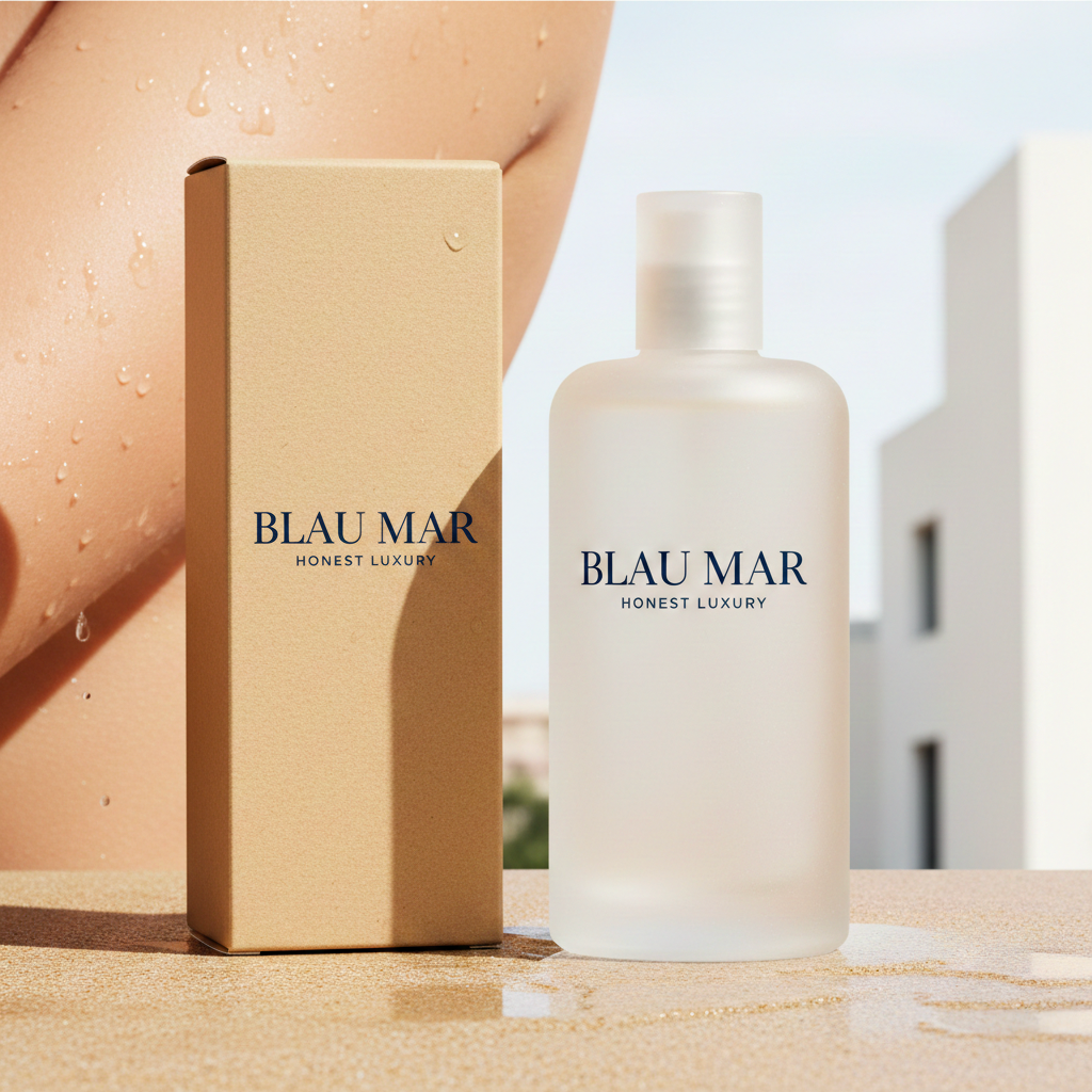
Case Study: "BLAU MAR"
The Challenge: to position a local, organic skincare brand in a crowded market by moving away from clinical aesthetics toward a premium, sensory experience.
The Solution: "Blau Mar" uses a minimalist visual language inspired by the Mediterranean horizon. The palette reflects the deep sea and coastal sands, while the airy typography conveys purity and transparency.